Online flower shop homepage: how to sell more online
The homepage of an online florist is the digital storefront that decides in seconds whether visitors become customers, which is why it must clearly convey the location, services and uniqueness of the brand. Professional images, visible order buttons and a mobile-optimised structure turn a simple homepage into a sales engine for any florist.
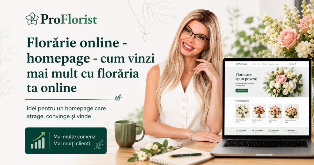
The front page of an online florist is the digital shopfront that can decide the success of sales. Within seconds, visitors decide whether to stay or leave. That’s why a well-constructed homepage – with unified images, clear location and delivery information, an overview of services and visible order buttons – is essential to turn simple visitors into customers. If you want to learn how to sell more flowers online, start right with your website’s homepage.
Why first impressions matter more than you think
Let’s be honest: when someone lands on your florist’s website, they don’t read every page carefully. He scans quickly, lets himself be guided by the images and the first words that appear in front of him. In just a few seconds, his brain decides if you are the “right choice” or if he should look for another online florist.
This reality may seem harsh, but it is also a huge opportunity. The first page of your website – the homepage – is like the window of a street flower shop: it must attract, transmit confidence and convince the passerby to enter. The difference is that, online, “shoppers” are visitors who instantly compare multiple sites, and their patience is measured in seconds.
An effective homepage does not only mean a beautiful design. It means a clear structure, professional images, well-thought-out messages and a visible route for the customer: from inspiration to order. For example, a simple “Order flowers online” button positioned at the top can make the difference between a lost visit and a successful sale.
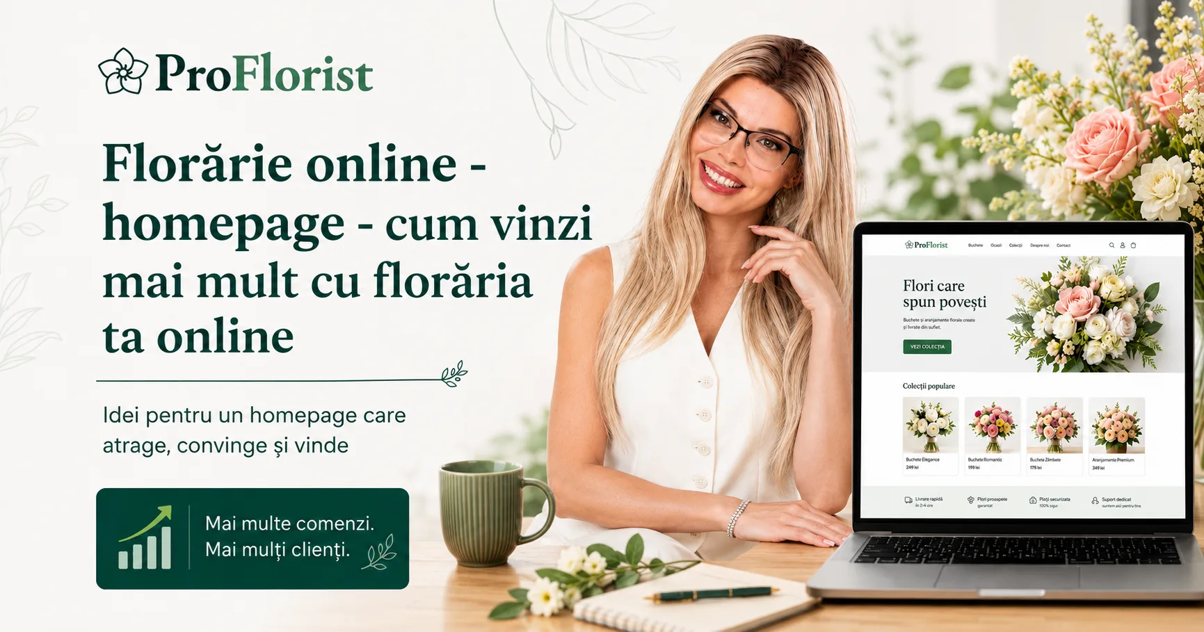
For the modern florist who wants to grow his flower business, the homepage becomes the most important digital sales tool. It’s where you tell your story, where you show what makes you unique, and where you demonstrate that your deliveries are safe, fast and tailored to your customers’ needs. Without these elements, even the most beautiful bouquets can go unnoticed.
In the following pages, we will explore step by step what an online flower shop homepage must contain to turn visitors into loyal customers: from the clarity of basic information and impactful photos, to conversion strategies and local SEO optimisation.
How to Create an Online Florist Homepage That Attracts and Sells
Why the homepage is the digital showcase of your flower shop
In a world where customers search for flowers online with a few taps on their phone, a florist’s homepage is more than just a home page. It’s the digital shopfront that can win or lose a customer in less than 10 seconds. Immediately after entering the site, visitors scan images, colours and texts, looking for clear signals: where you are, what you offer and how they can order.
For a flower business, the homepage should be seen as a sales tool, not just a presentation. An impactful photo, a simple message, and a well-placed order button can trigger a purchase decision faster than a long, technical text. Just as florists carefully arrange their physical shop window, the digital space must be thought of in the same way.
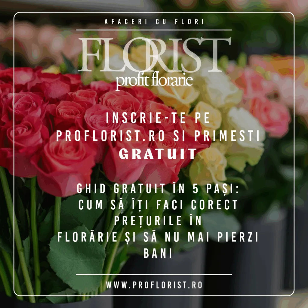
Online flower shop, what you need to sell more:
- Clear and unified pictures
- Clear message with the specifics of your flower shop
- Attractive banners
- Interesting call to action
- Visible and clear prices
- Customer benefits for delivery
How customer focus works online
People don’t read web pages like a book, they go through them visually, looking for landmarks. Their eyes stop at images, headlines and colored buttons. If they can’t quickly find the information they need—the location, the service they want, or an order button—they move on to another online florist. In a competitive market, where “order flowers online” is a daily search for thousands of Romanians, the difference between success and failure lies in a few seemingly small details.
Location and identity: how to make it clear where you are
One of the biggest mistakes florists make is to hide the location of the flower shop. Customers enter the homepage and do not realise if the florist delivers in Bucharest, Cluj or Iasi. In seconds, you lose an order just because you left this information in the footer of the page or hidden on a secondary page.
The importance of location for customers and Google
Both customers and Google need to immediately see where you are doing. When you write “Bucharest online florist – same day flower delivery”, you provide clarity to visitors and a signal for the search engine to show you locally. It’s a simple detail, but essential for daily sales.
How to brand your flower shop
The identity of the florist should appear from the first screen: name, style and tone. If you’re a florist specializing in luxury arrangements, convey that with a simple message. If you are betting on seasonal, natural and affordable flowers, show this in the first words and images. Customers are not just looking for “flowers”, but florists with personality, which convey emotion and confidence.
Service clarity: what you do and for whom
A visitor who does not immediately understand what you offer will leave the site, even if you have the most beautiful pictures. Saying “we are an online florist” is not enough. You must clearly state whether you deliver bouquets daily, make decorations for weddings, offer corporate services or funeral arrangements.
Short-term offers vs. special services
A customer who wants to quickly order a birthday bouquet needs a visible “Order Flowers Now” button. In contrast, a bride looking for a wedding florist needs a different message, like “Request a quote for the event.” Clear division of services helps to attract each type of customer correctly.
How to avoid inappropriate requests
If you don’t make it clear what you are doing, you will receive unnecessary messages. For example, if your florist does not deliver to your home, but this is not specified, customers will insistently ask. Clarity reduces confusion and brings you only relevant commands.
What sets you apart from other online florists
The online floristry market is competitive. Why would someone choose your flower shop? The answer must be visible on the homepage. Maybe you use only local flowers, offer fast two-hour delivery, or maybe your arrangements are inspired by modern art.
Building an authentic story
A simple statement like “We like flowers” is not enough. Every florist loves flowers. Instead, tell your story: how you choose each flower, what customers say after receiving a bouquet, how you deliver with personal attention. These details create the emotional connection that turns visitors into loyal customers.
Example of “visual signature”
Some florists are known for their rich and colorful bouquets, others for minimalism and clean lines. Whatever the style, it must be seen in the photos and presented clearly on the homepage. Thus, customers know exactly what to expect.
The Power of Images: How to Use Photos That Sell
Flowers are about visual emotion. Online, photos are the main selling point. A homepage with dark, jumbled images and no visual unity does not inspire confidence.
Why a solid background matters
Product photos must have uniform backgrounds and be taken from the same angle. Thus, the site looks coherent, and customers perceive the brand as professional. In a market where details make the difference, a poorly photographed bouquet can be the reason why the customer chooses another florist.
Photos that convey emotion
Not every close-up with flowers is enough. Choose images that show the entire bouquet, proportions and style. A photo of an arrangement on an elegant table or in the hand of a smiling customer is worth more than 1000 words. Visual excitement is what sells in floristry.
Call-to-Action: how to turn visitors into customers
People need guidance. If they enter the website and see a bouquet they like, they need to know immediately what to do: order, ask for a quote or contact the florist.
Examples of effective CTAs for online florists
A simple “Learn more” doesn’t work. Instead, buttons like ‘Order flowers online now’, ‘Request wedding quote’ or ‘Book a consultation’ are clear and guide action.
How to categorize customers
If your florist offers both daily delivery and event services, create two large, separate buttons. Thus, each customer goes directly to the route that interests him, without confusion or additional steps.
Optimisation for mobile and speed
More than half of customers search for flowers online from their phone. If your homepage only looks good on desktop, you are losing most of your visitors.
Why mobile-first is mandatory
On a small screen, texts must be readable, images optimised, and buttons large and easy to press. A homepage that is not responsive conveys a lack of professionalism and causes customers to look for alternatives.
Loading speed as a deciding factor
A slow site with unoptimized images or useless animations makes people leave immediately. For a florist company, where the purchase decision is often impulsive, every second counts. A fast homepage significantly increases the conversion rate.
{
“@context”: “https://schema.org”,
“@type”: “FAQPage”,
“mainEntity”: [
{
“@type”: “Question”,
“name”: “How can I quickly order flowers online from the homepage?”,
“acceptedAnswer”: {
“@type”: “Answer”,
“text”: “On the homepage you will find a clear button “Order flowers online now”, which takes you directly to the store. You choose your favourite bouquet, fill in the delivery data and complete the payment in a few simple steps.”
}
},
{
“@type”: “Question”,
“name”: “Do you deliver flowers on the same day?”,
“acceptedAnswer”: {
“@type”: “Answer”,
“text”: “Yes, for orders placed before 18:00, we offer same-day delivery in Bucharest and surrounding areas.”
}
},
{
“@type”: “Question”,
“name”: “Can I order flowers for an event (wedding, christening, corporate)?”,
“acceptedAnswer”: {
“@type”: “Answer”,
“text”: “Yes. The home page is divided into two sections: fast flower deliveries and event arrangements. For events, you will find the button ‘Request Event Quote’.”
}
},
{
“@type”: “Question”,
An online florist homepage is not just a presentation page, but the first and most important interaction between your brand and potential customers. In seconds, people decide if your florist conveys confidence, excitement and professionalism – or if they move on to the competition.
With clean and unified images, clear messaging about location and services, a visible Call to Action and a mobile-friendly structure, your homepage becomes a virtual shopfront that attracts eyes and turns visitors into buyers.
If you want to sell more flowers online, start by analysing your home page: is it clear, compelling and tailored to the needs of your ideal customer? If the answer is “no” or “I’m not sure”, it means it’s time for an optimisation.
🌸 Now it’s your turn:
If the answer is no, take action.
View your florist’s homepage through the eyes of a customer in a hurry.
Ask yourself: “Do I know in 5 seconds who I am, what I offer and how I can order?”
For more details or personalised support, you can contact us by email at membri@proflorist.ro. Join the ProFlorist community of florists today – the place where we support each other to grow the Romanian flower industry – and turn your dream into a successful flower shop!
You may also be interested in:
Related articles
More ideas from the same area
Business & Management / Events & Community / Florists & Stories / Marketing & Sales / Supply & Flower Industry
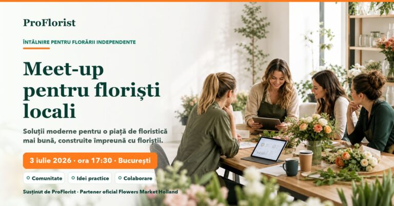
ProFlorist’s Bucharest florist meeting on 3 July 2026: event archive
Archive note: this meeting took place in Bucharest on 3 July 2026. The article…
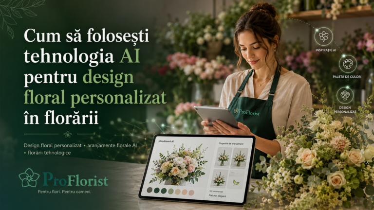
How flower shops can use AI for personalised floral design
Artificial intelligence is starting to change the way customers discover, choose and buy products,…
Business & Management / Florists & Stories / Marketing & Sales
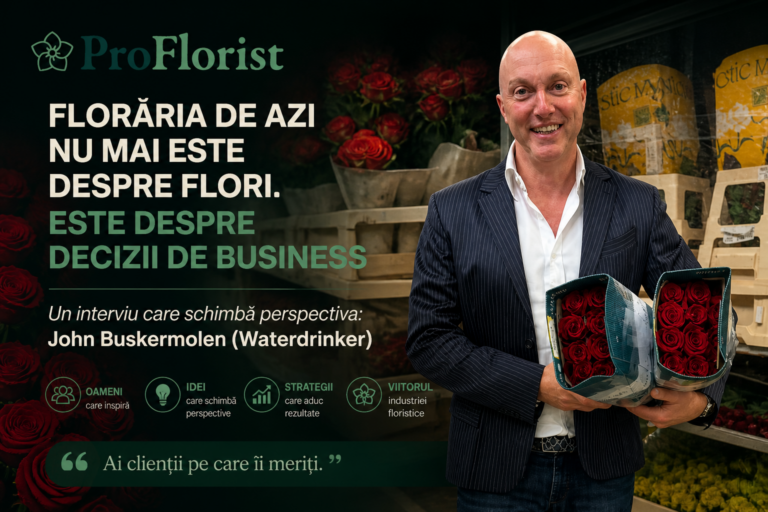
Today’s flower shop is also about business decisions: an interview with John Buskermolen
John Buskermolen of Waterdrinker discusses supply, differentiation, costs and structured growth. His answers are…